
Waterloo gives its cans and cartons a clearer flavor signal
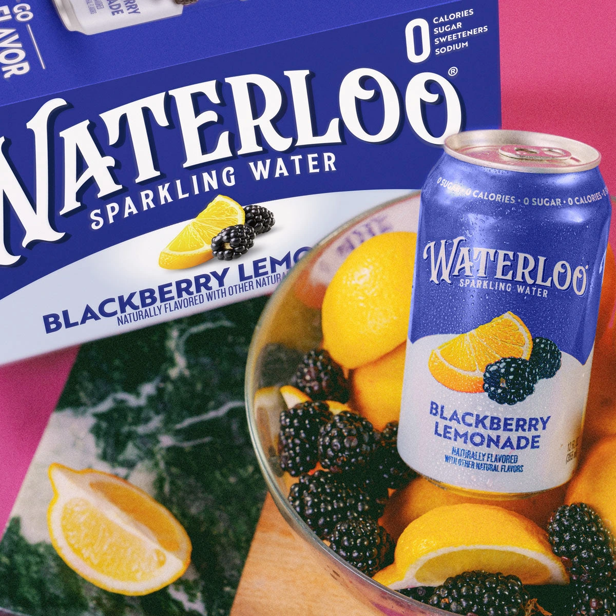
The CBX refresh enlarges the name and sharpens the fruit cues.
Waterloo announced a packaging refresh on August 4, 2026, covering its sparkling-water cans and cartons across pack sizes. Developed with brand agency CBX, the design gives the Waterloo name more prominence and uses saturated colors and prominent fruit cues to distinguish flavors.
A more prominent name on the shelf
The brand calls this its first packaging revamp since launching in 2017. Its stated goals are easier recognition, clearer flavor distinctions and better visibility wherever people shop. The official Blackberry Lemonade photograph shows that approach directly: a large white wordmark, a blue field and lemons and blackberries beside the flavor name.
Waterloo says the sparkling-water flavors themselves remain the same. A September 1 update said the new packaging was continuing to roll out in stores and online, and appeared on the brand’s Can Cruiser tour vehicle.
Cleaner to some shoppers, less distinctive to others
A shopper thread on r/sparklingwater contains both reactions. Some commenters preferred the larger name and simpler design; others missed the older pack’s detail and character. These are individual opinions, rather than a measure of overall customer response.
The refresh makes the tradeoff visible: a familiar brand is trying to make its name and flavors easier to read at a glance. Whether that improves shopping or sales is a separate question from the design change.