How BYOMA Puts Education on Pack
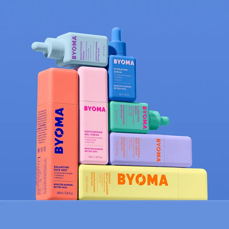
Bright bottles carry a careful hierarchy of product names, ingredient roles and routine steps.
BYOMA uses the sides of a bottle to answer different questions. Pearlfisher’s packaging artwork separates the product name, ingredient functions and routine steps. Its bright range shows how a small object can hold several levels of explanation.
Give the range a recognizable shape.
Pearlfisher describes an identity intended to attract attention and educate. Its bright palette and square packaging make the range easy to recognize as a family. In the supplied photography, yellow, peach, pink, blue and green containers share broad faces and prominent BYOMA lettering, even as pumps, caps and droppers change.
Color does one part of the work. The words still have to identify what someone is holding. Names such as Creamy Jelly Cleanser, Balancing Face Mist and Hydrating Serum are printed directly on the packs. A shopper can begin with the product’s job, then read further. The design does not require them to memorize a color code before finding a cleanser.
That combination gives the system room to vary. A single silhouette or identical closure is not doing all the recognition work. The shared lettering, panel structure and repeated language can connect products with different dispensing needs.
Give each panel a different question.
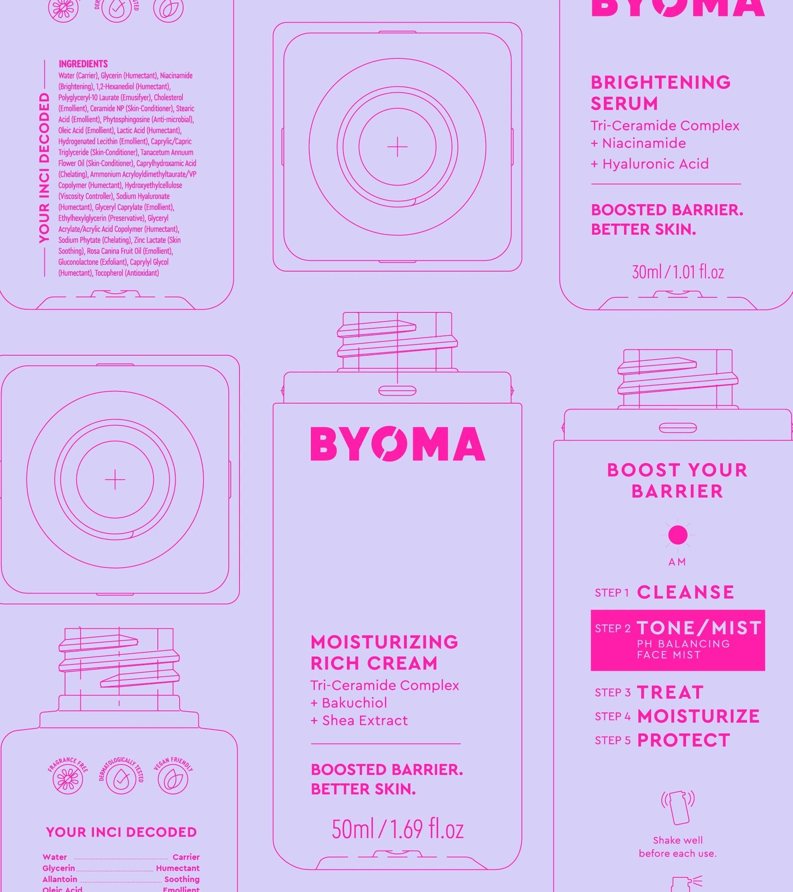
The agency’s packaging artwork shows a useful division of space. A front panel names the product and calls out selected ingredients. A second panel sets out routine steps. The ingredient panel adds a function beside individual ingredient names. Each face offers a different level of explanation.
This is where the square shape becomes interesting beyond its appearance. Its flat faces create separate reading surfaces. Someone comparing bottles can use the front; someone looking more closely can turn the same object and find more detail. The package does not have to put every sentence into one hierarchy.
The distinction between a callout and a list matters, too. Highlighting a familiar ingredient can draw attention, while showing other ingredients with their functions acknowledges that a formula has several jobs. That is an information-design observation. The presence of an ingredient name on a label does not establish a product’s effectiveness.
Continue the explanation on the website.
BYOMA’s About page makes clearer education and simpler routines part of its stated purpose. The Byology Class page gives that ambition a destination: a barrier-care introduction, an ingredient-function glossary and a routine organized by steps. Readers can move from the short labels on a bottle to a longer explanation in the same vocabulary.
The glossary is a particularly concrete extension. Terms such as humectant, emulsifier and preservative appear as functions with brief definitions. The page also places named products under cleanse, tone or mist, treat, moisturize and protect. It connects product selection to a sequence without requiring a paragraph of instructions on the front of every bottle.
For another brand, the useful question is which explanation belongs where. A package is handled, turned and read at close range; a website can hold a glossary or a longer routine. Reusing the same terms across both surfaces helps the reader continue a question they have already started.
Check the package in use as well as in print.
Clear information and reliable dispensing need separate checks. In a Reddit discussion about a BYOMA pump, one user described a bottle that would not dispense; replies explained the airless mechanism, while other users said they disliked the packaging. These are individual reports about particular products, with no way to estimate a failure rate. They do identify a useful question for a packaging brief: does the mechanism need an explanation of its own?
Refills need the same specificity. On October 27, 2026, BYOMA’s US refill collection listed Balancing Face Mist Refill and Clarifying Serum Refill, with the latter marked sold out. That narrow listing does not establish that every bottle in the agency’s range photograph can currently be refilled. Nor does the square shape, on its own, establish an environmental advantage.
BYOMA offers a useful model for deciding what a label should explain. Begin with the product’s name and job, assign different questions to different panels, then give the longer explanation a clear destination. Keep testing the physical experience alongside the words. Both affect what happens after someone picks up the bottle.